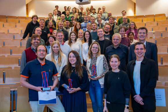


A scientific poster must accomplish in a small space what theses often require more than 100 pages to achieve: it should present research in a way that is understandable, concise, and engaging. Veit Soffner, a graduate of the Master’s program in Applied Psychology at Hof University of Applied Sciences, proved that he succeeded in doing just that. At the 26th Interdisciplinary Congress on Addiction Medicine in Munich, his poster stood out among 30 other entries from renowned universities and research institutions and was honored by the expert jury.
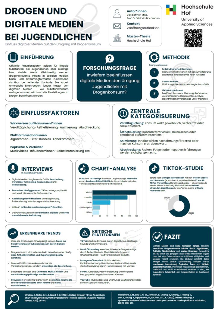
The starting point for Veit Soffner’s poster was his master’s thesis on the influence of digital media on how adolescents deal with drug use. The jury was impressed not only by the scientific relevance of this previously under-researched topic but also by its clear and professional presentation. But how does one actually create a scientific poster that captures attention while also being academically compelling?
The most important message first
For Soffner, the first step wasn’t choosing colors or layouts, but rather identifying the core of his research. After all, a poster must be understandable in just a few minutes. “DIN A0 sounds like a lot of space at first. But when you consider that you have to summarize over 100 pages of work, it quickly becomes a challenge,” he points out. That’s why he systematically distilled his master’s thesis down to its essential content. Together with his advisor, Prof. Dr. Viktoria Bachmann, he developed a clear structure consisting of an introduction, research question, methodology, results, discussion, and conclusion. Anything that didn’t directly contribute to the central message was removed.
Less is often more
With scientific posters in particular, there’s a temptation to cram in as much information as possible. For Veit Soffner, this was precisely one of the biggest challenges. Instead of trying to fit in as much text as possible, he recommends having the courage to leave things out. The core message must remain clear at all times. He also adopted a minimalist approach to the design. Subtle colors, easily readable font sizes, and ample white space ensured that viewers could quickly find their way around. He highlighted key findings with a few, meaningful diagrams placed centrally on the poster.
Sketching, Experimenting, Discarding
It took a long time to finalize the layout. Several drafts were created and then discarded. In the free program Canva alone, numerous different variations accumulated before the final design emerged. For Soffner, this experimentation is an integral part of the development process:
“It’s only with some distance that you can see which elements work well together and where there’s still room for improvement.”
Veit Soffner
He received ongoing support from Prof. Dr. Viktoria Bachmann, who provided feedback on the structure and design. She also offered this tip:
“Print out your designs and view them from the usual 3-meter distance—it looks different on the computer than it does from the perspective of a standing viewer.”
Prof. Dr. Viktoria Bachmann

Making Science Accessible to Everyone
A good poster isn’t aimed exclusively at specialists. Especially at conferences, researchers from a wide variety of disciplines come together. That’s why scientific precision must be combined with language that’s accessible to everyone. “My rule of thumb for this kind of work is always: Explain it in a way that someone with absolutely no knowledge of the subject can understand,” explains Soffner. This approach has helped him convey complex research in an understandable way without sacrificing scientific accuracy.
Design and Content Go Hand in Hand
In addition to the quality of the content, visual impact also played a decisive role. Colors, font sizes, and—in particular—the positioning of individual elements influence how quickly readers can grasp the content. A poster must draw the eye and spark curiosity before the audience even begins to engage with the details:
“What good is the most beautiful poster in the world if the content is just a mess? On the other hand, I could present Nobel Prize-winning research—but it’s pointless if no one looks at it because it’s boring.”
Veit Soffner
Tips for Your Own Poster Competition
Based on his experience, he offers some recommendations for students: “First, the central message should be clearly defined. Next, you need to consistently pare down the content and organize it into a clear structure. Multiple sketches and layout variations help you find the optimal design. Feedback from advisors or fellow students is just as important. And finally, it’s worth taking a look at posters that have already been successful, as well as relevant online tutorials,” the successful graduate concluded.